
Hand-lettered Signs in Iraq and Michael Bierut's Origin Story
Like most designers, I came across one of Michael Bierut’s talks as I was in the early days of my design career. I really love his origin story where he speaks of being around 6 years old when he noticed Clark’s Forklift logo where the letter “L” visually “carries” the letter “A” - just like a forklift would carry a load.
The logo the inspired “seismic jolt” in Michael Beirut.
I marveled at the fact that he was so young and could see what design could do. At that moment, I wondered if I had that sensitivity at all as an adult to see the same thing in the environment around me.
I carried that story with me as I grew as a designer.
On my last trip to Baghdad, as I looked out the window on our 5-hour drive into the city, I started to notice these makeshift signs along the highway. I started to notice them everywhere. They read “Crane” in Arabic and included a number. Should you get a flat tire or your car breaks down along the way (highly likely on the roads to Baghdad) you have access to a number for help instead of a convenient mobile app.
And that’s when I saw it -
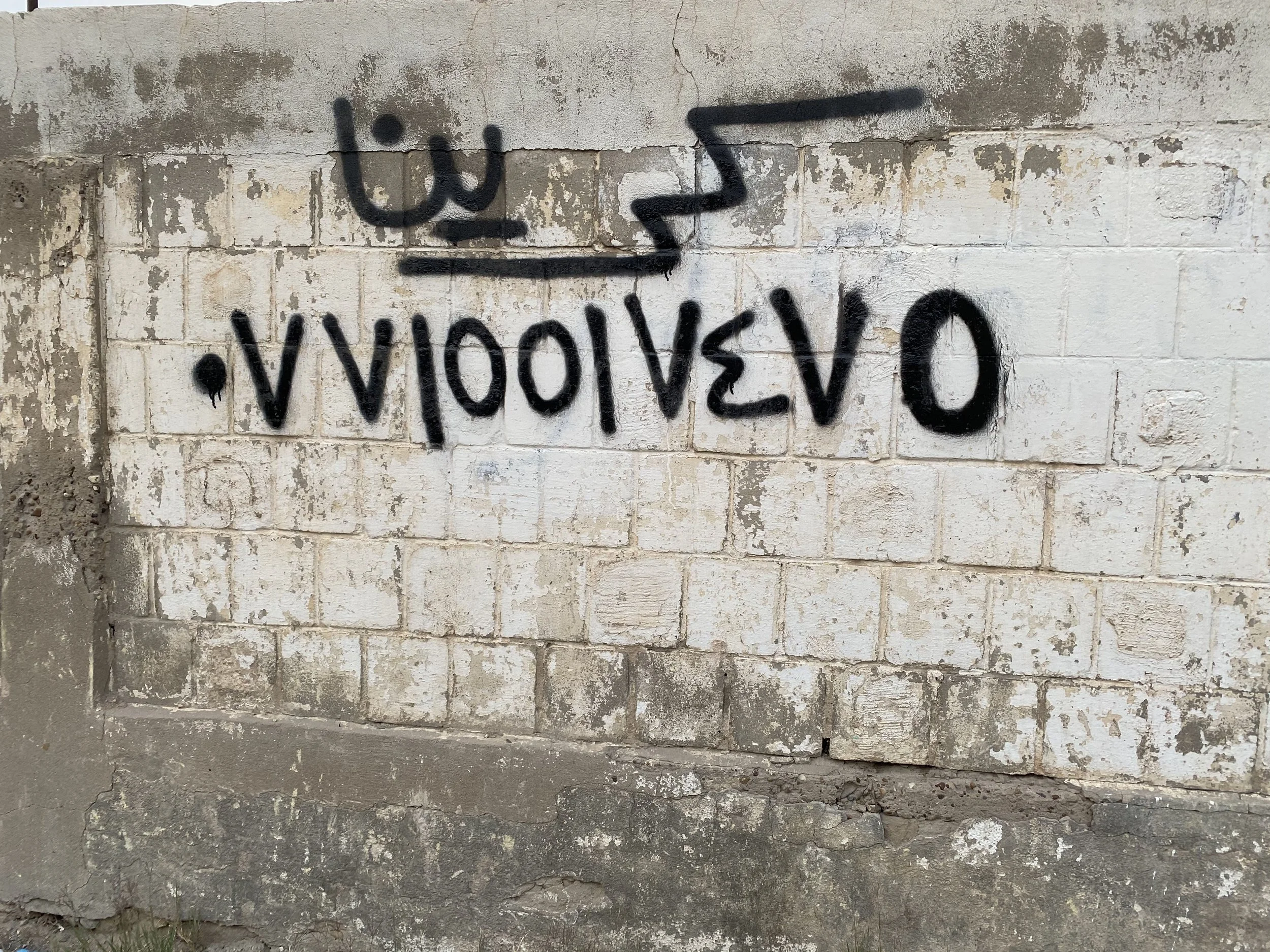
The “ر” letter in Arabic lifts the rest of the word, just like a tow truck lifts a car. Just like Michael Bierut’s design origin story. The parallel was brilliant and I couldn’t believe my eyes!
I looked around the car to speak to someone, to make sure this was a real observation I was making. So, I asked my cousin in the car, “Do they do this on purpose with the lettering? Or is it meant to convey some other idea?” My cousin looked at me and casually laughed, “It doesn’t mean anything, it’s just the way they write it.”
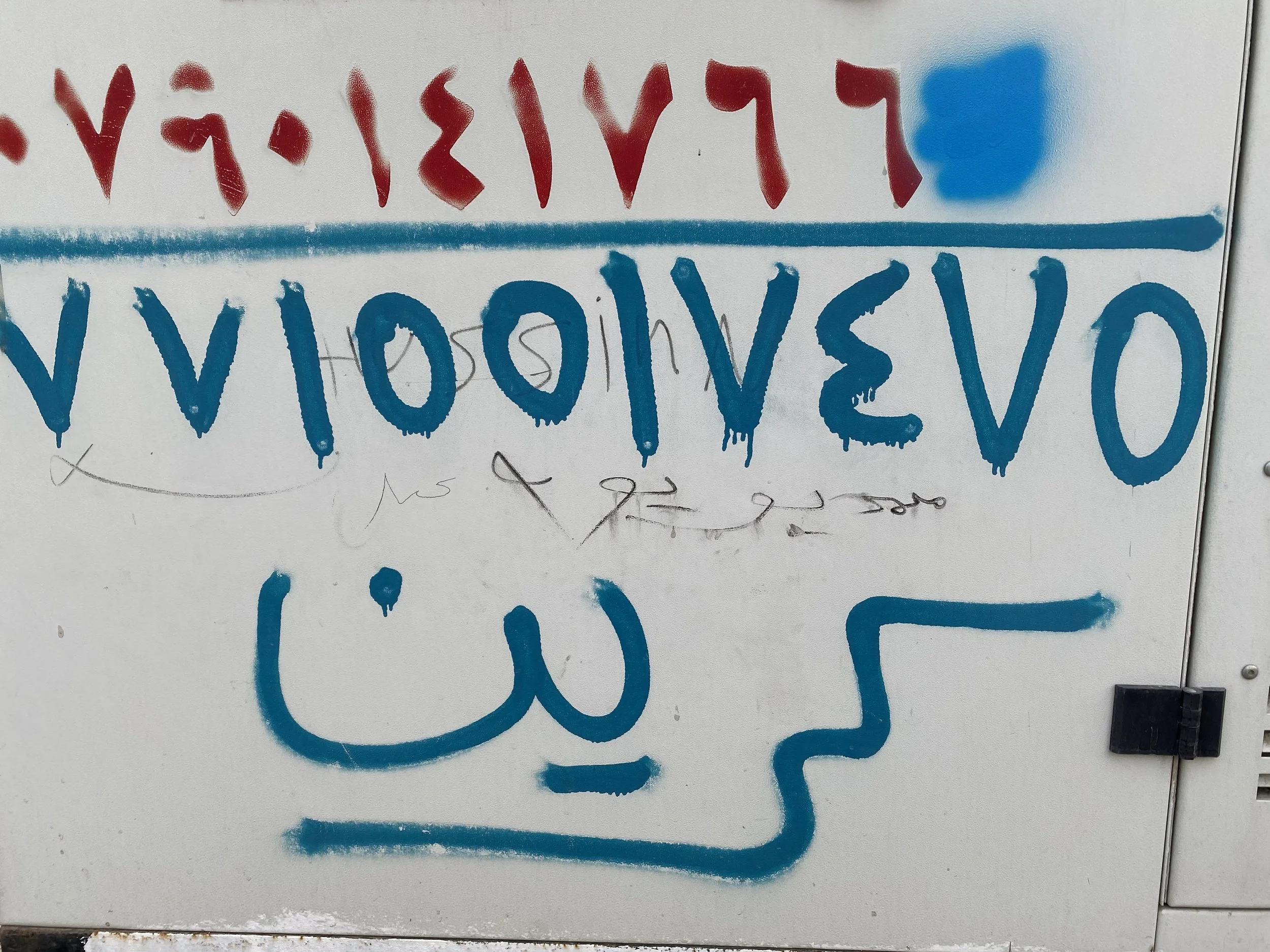
كرين - “Crane” or Tow Truck in Arabic spray painted on the streets of Baghdad, Iraq.
I took a long pause, I could see it. I could see the magic that Michael Bierut saw!
It hit me, that we designers have a more acute sensitivity to the environment around us. Some will never think twice about the brilliance of a design, especially when it speaks directly to their subconscious.
There it was, right in front of me, the power of design so strong, and I was able to see it.
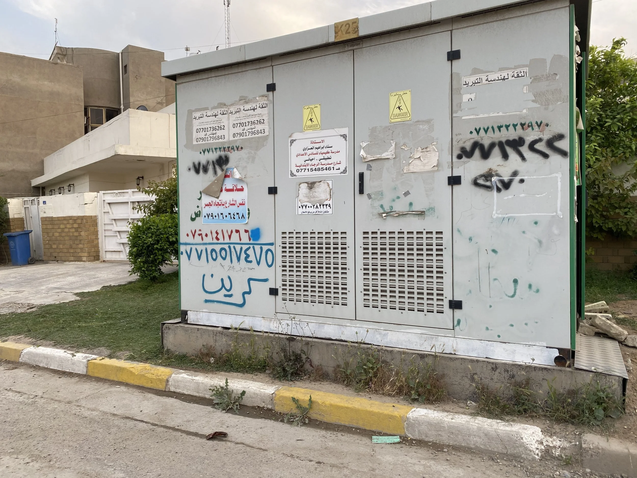
A picture showing all the other types of numbers for services left, but the “crane” service visually stands out immediately because of its typographic effect with the lettering.